
Now that indexing is complete, my iPhone, iPad, and Mac have settled down, here are my honest thoughts on Liquid Glass.
Liquid Glass Puts Focus Back on Great Software Design and Makes iPhone, iPad, and Mac Fun to Use
iOS used to have a lot of character. Every corner of the operating system was meticulously designed to invoke a sensation of awe. A good example of this was when Steve Jobs showed off iBooks during the launch of iPad back in 2010.
Rather than just abruptly go to the next page while reading a book, a beautiful page-turning animation would make that transition that much interesting. It made you want to turn that page again and hold it half way, just for some kicks.
Apple was casually showing off what its software was capable of doing and wanted users to love all of it, and they did.
Another example of this was the Camera app. Every time you pressed the shutter button, you’d see a shutter animation on the display, making every snap feel special and truly yours.
Want one more example for the road? The Google Maps app made by Apple itself. When you dropped a pin, it would fall from the sky and land on the map. An iconic animation which a lot of people use today as well.
Such things were present throughout iOS, and it suddenly went away with iOS 7.
It basically kicked off a race between developers who would create and ship the most boring-looking app on the planet, and we were desperately waiting for app updates to arrive with those changes too – all in the name of minimalism.
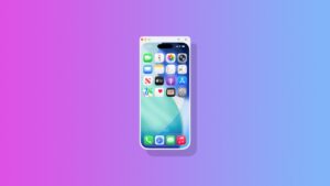
With iOS 26, iPadOS 26, and macOS 26, Liquid Glass takes me back to the pre-iOS 7 days where I can appreciate everything the software is visually doing for me.
It’s not bringing back the shutter animation to the Camera app or letting me drop pins in the Maps app. In fact, far from it. But it’s bringing great visual experiences which were part of the skeuomorphic days of iOS, while keeping the modern design aesthetic alive and well.
Whenever I see those floating buttons in the Photos app or App Store, I swipe around just to see how the glass bubble tracks. I scroll around mindlessly at times just to appreciate the glass effect and how the background morphs under it.
And, the icing on the cake is how menus and buttons don’t just appear out of thin air like how they did in iOS 18 or iPadOS 18. They transition from one shape to the other, just like liquid. It makes you love software, and put focus on the underlying UI rather than just your content.
In short, Liquid Glass is exactly what I wanted on my iPhone, iPad, and Mac. It makes using the device so much fun because it shows me its true capabilities as well rather than limited to boring, flat surfaces, and dare I say, awful-looking buttons for going back a page.
At this point, iOS 18 and iPadOS 18 feel like a mistake from Apple from a design standpoint that needed some sort of reversing without making it feel like that, and Liquid Glass makes that happen without dropping a hint.
The amount of care that has been put into Liquid Glass clearly shows – definitely a pun. From resizing apps freely in iPadOS to how content reveals itself through a button, it’s ambitious, bold, and forward-looking. I just wish Apple doesn’t backtrack in any way going forward.